MyPack Portal Re-Eval
This is a UX research + design project, re-evaluating NC State’s MyPack Portal Enrollment Wizard, which is used to register for classes.
I began this project by laying out a learning plan of my assumptions, how confident I was in each one, and how I could best learn more.
I then conducted a brief survey on students’ experience with this particular interface, via SurveyMonkey. Unfortunately, I was unable to get as many responses as I had hoped in the severely limited time frame I was given. The respondents ranged from 8 to 15 semesters of enrollment, and their responses were as follows:


My main conclusions drawn from this survey were:
-There is a lot of frustration with the software overall.
-My miniature card sorting activity proved that the order of functions doesn’t make sense.
-The calendar view is extremely useful.
-Everyone uses this software differently.
-Most users jump back and forth between the Enrollment Wizard and other functions, like MyPack Planner or the Degree Audit.
-Independent study enrollment is completely disconnected from the Enrollment Wizard, and can be frustrating and complicated.
-Communication with faculty is often the hardest part.
My options for guerilla research were severely limited by the fact that I did not get to this step before social distancing and lockdowns were in place for the Covid-19 pandemic, so for this step I observed a user who had never used this interface before.
I asked Joy to go through and register for an Art + Design elective in Summer Session 2, talking me through her thoughts as she went. I tried to only speak or respond to clear up questions regarding the prompt I gave her.
This supported my earlier survey results of frustration with the software as a whole, as well as its visual layout. It also let me find more specific frustration points for new users, as I and everyone I surveyed have been using this interface for years.
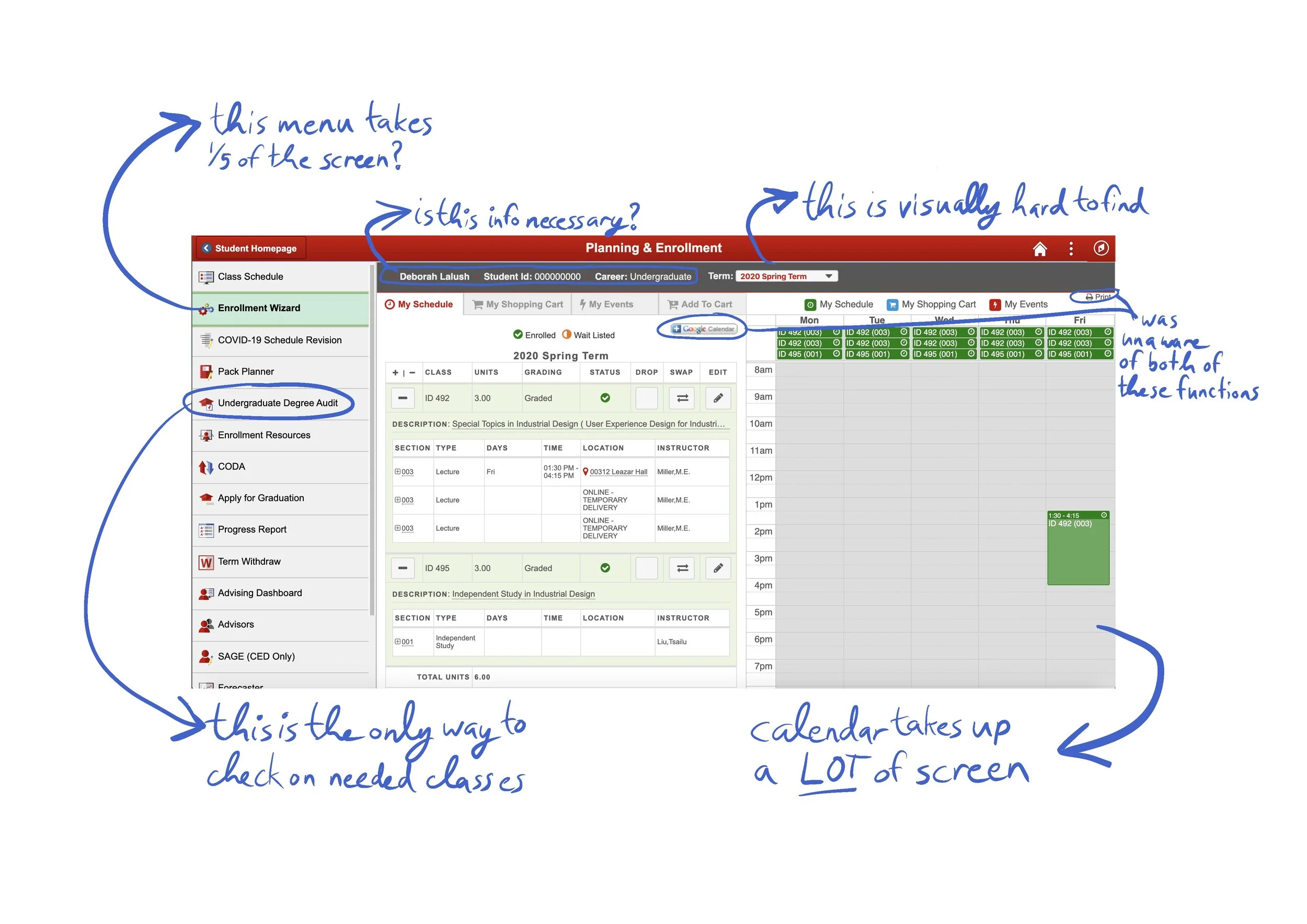
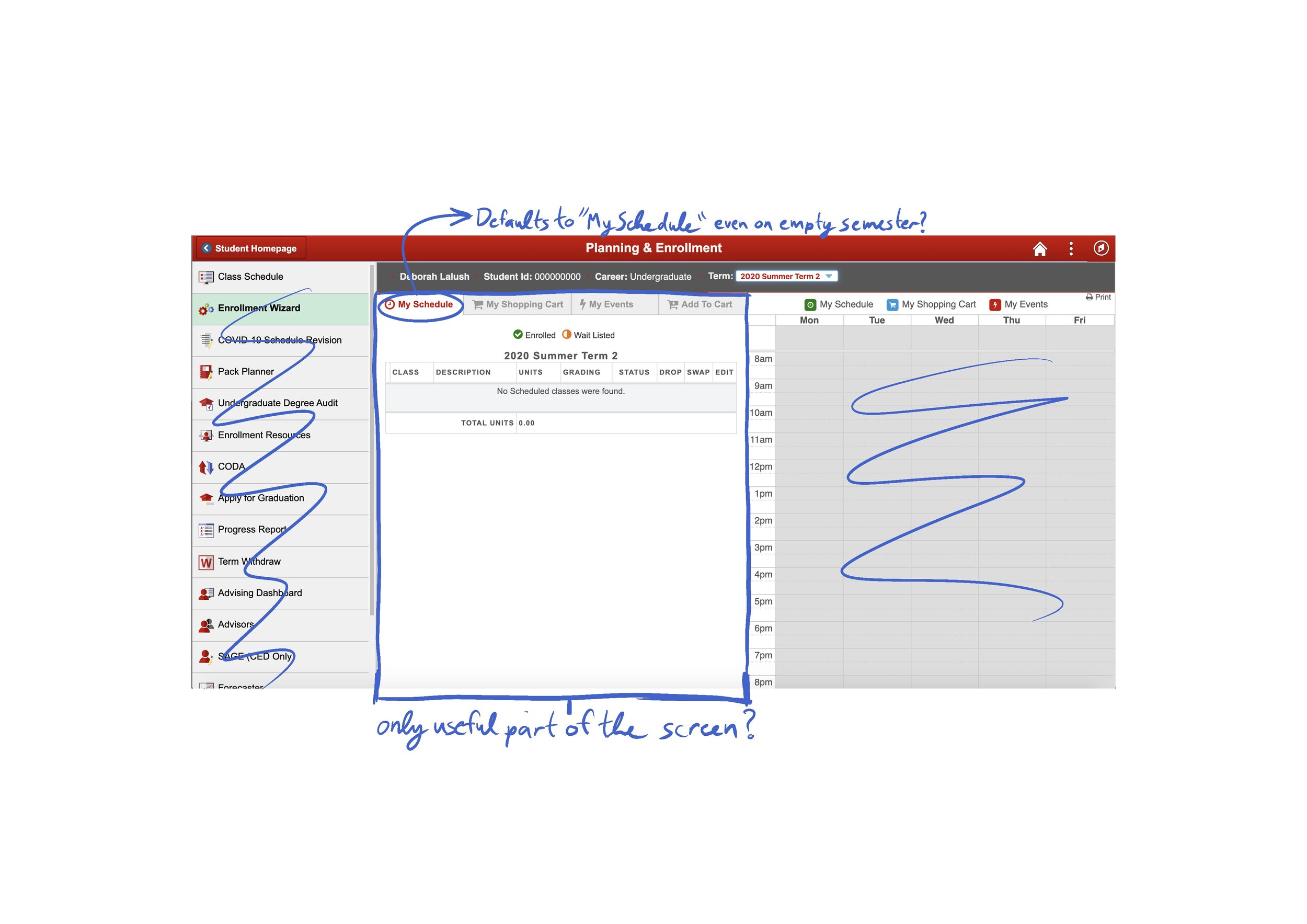
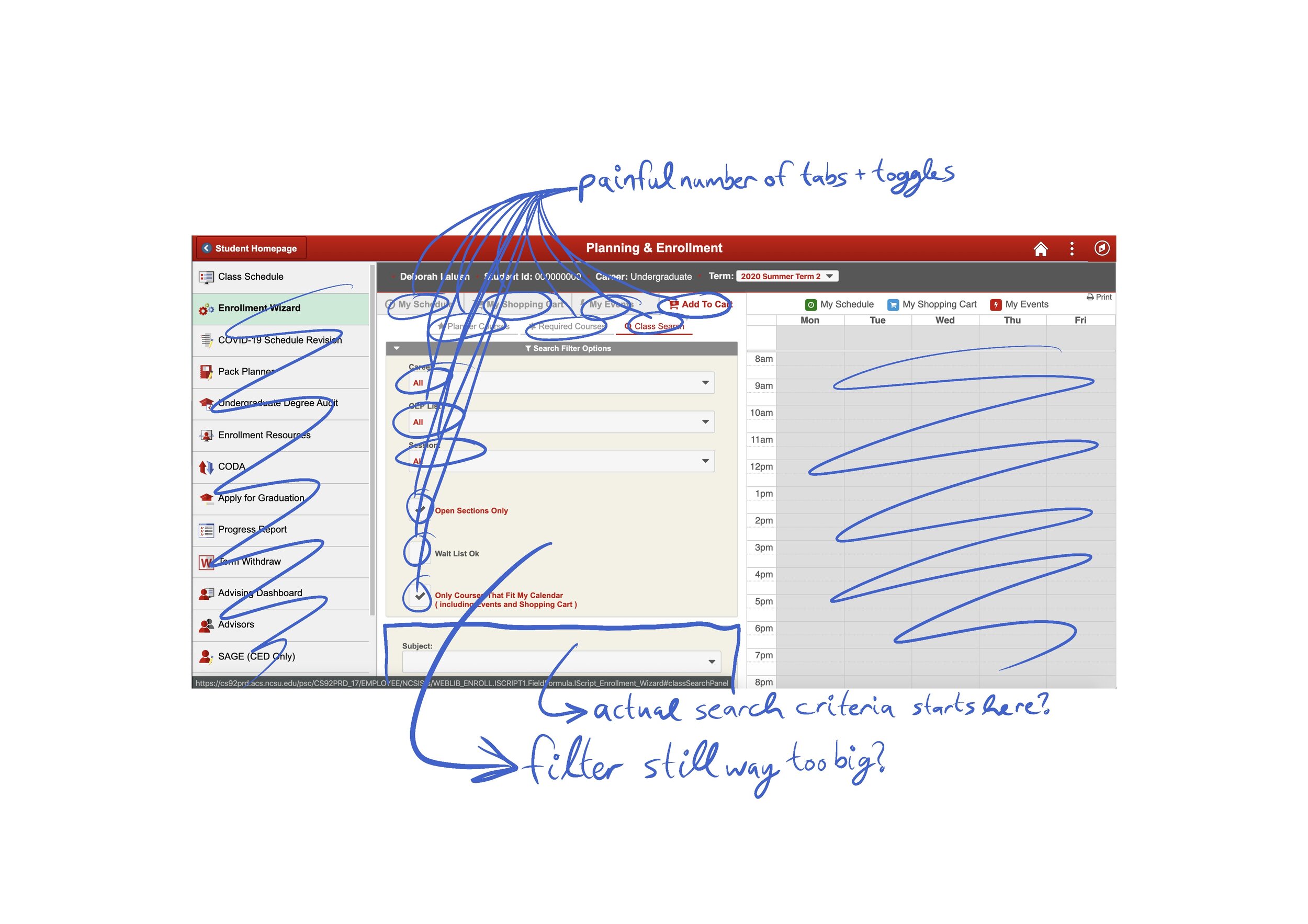
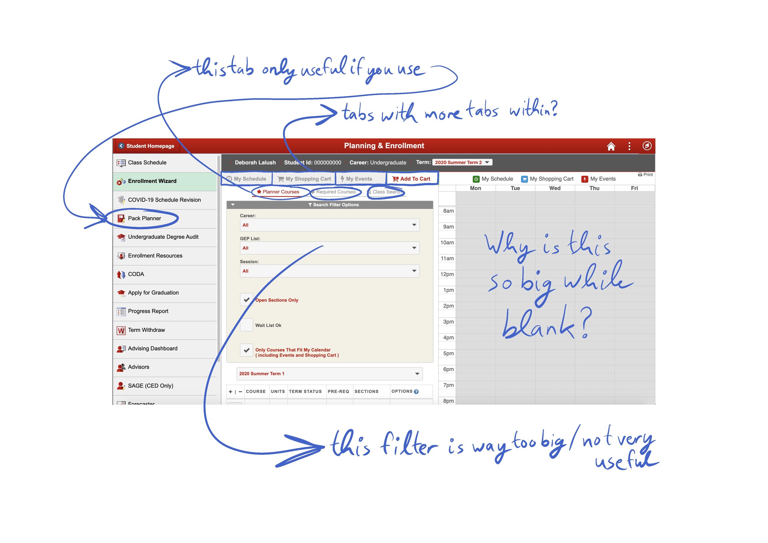
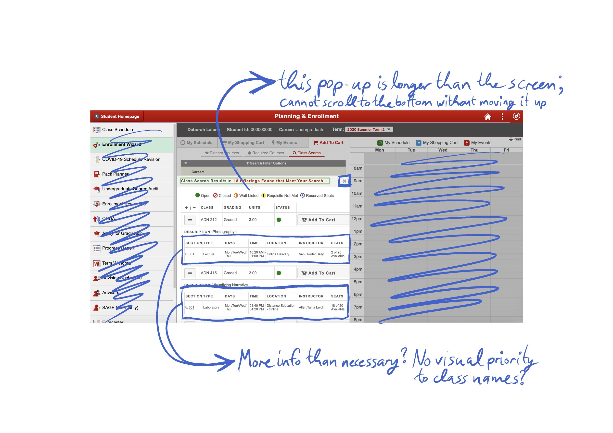
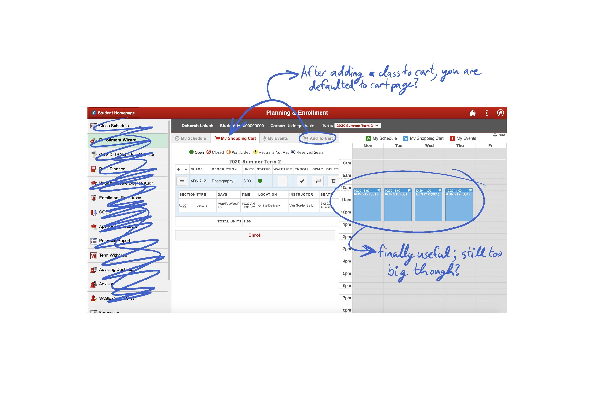
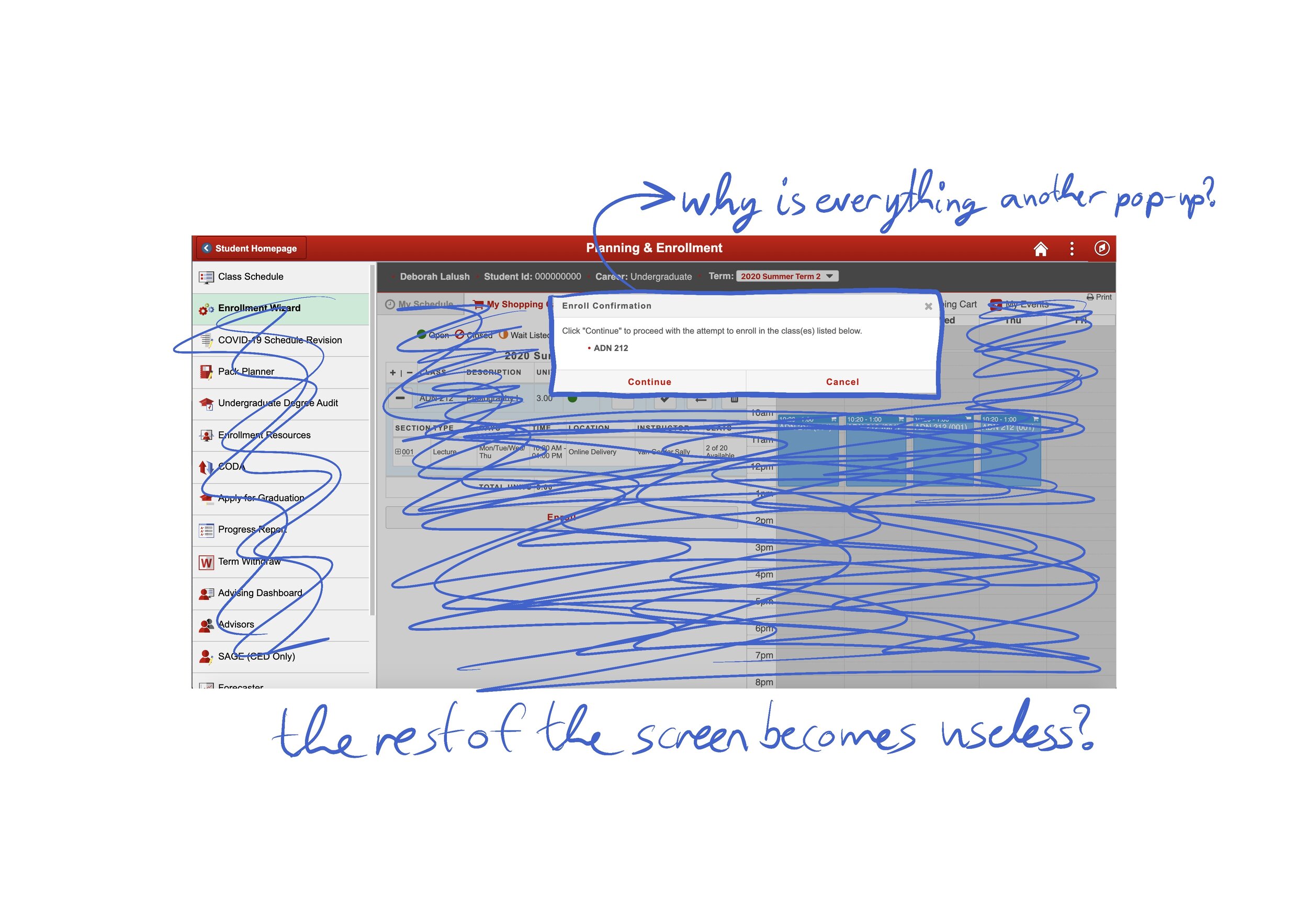
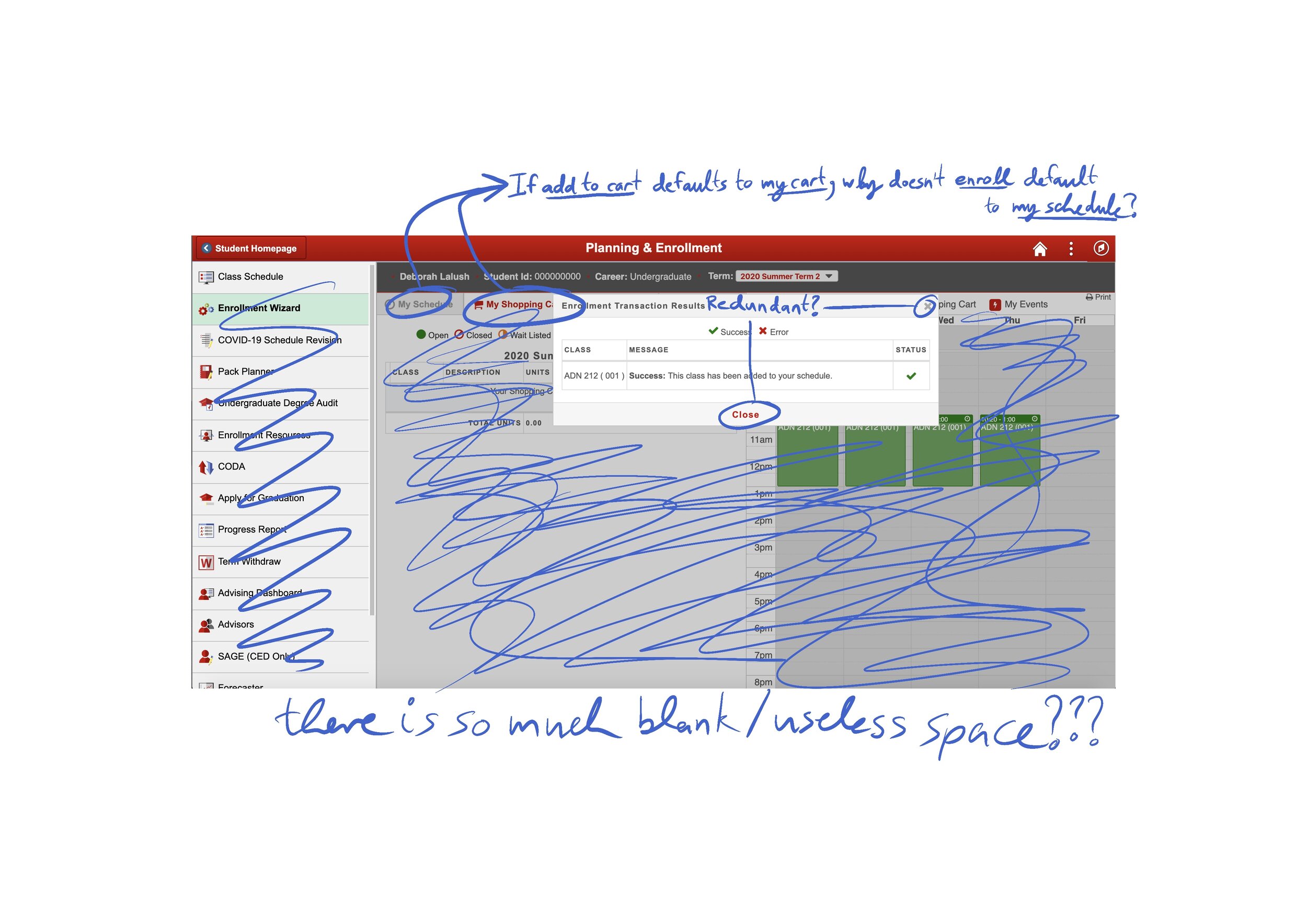
I then went into a Heuristic Markup, where I took screenshots of each screen along the way and marked them up with my thoughts on each screen.
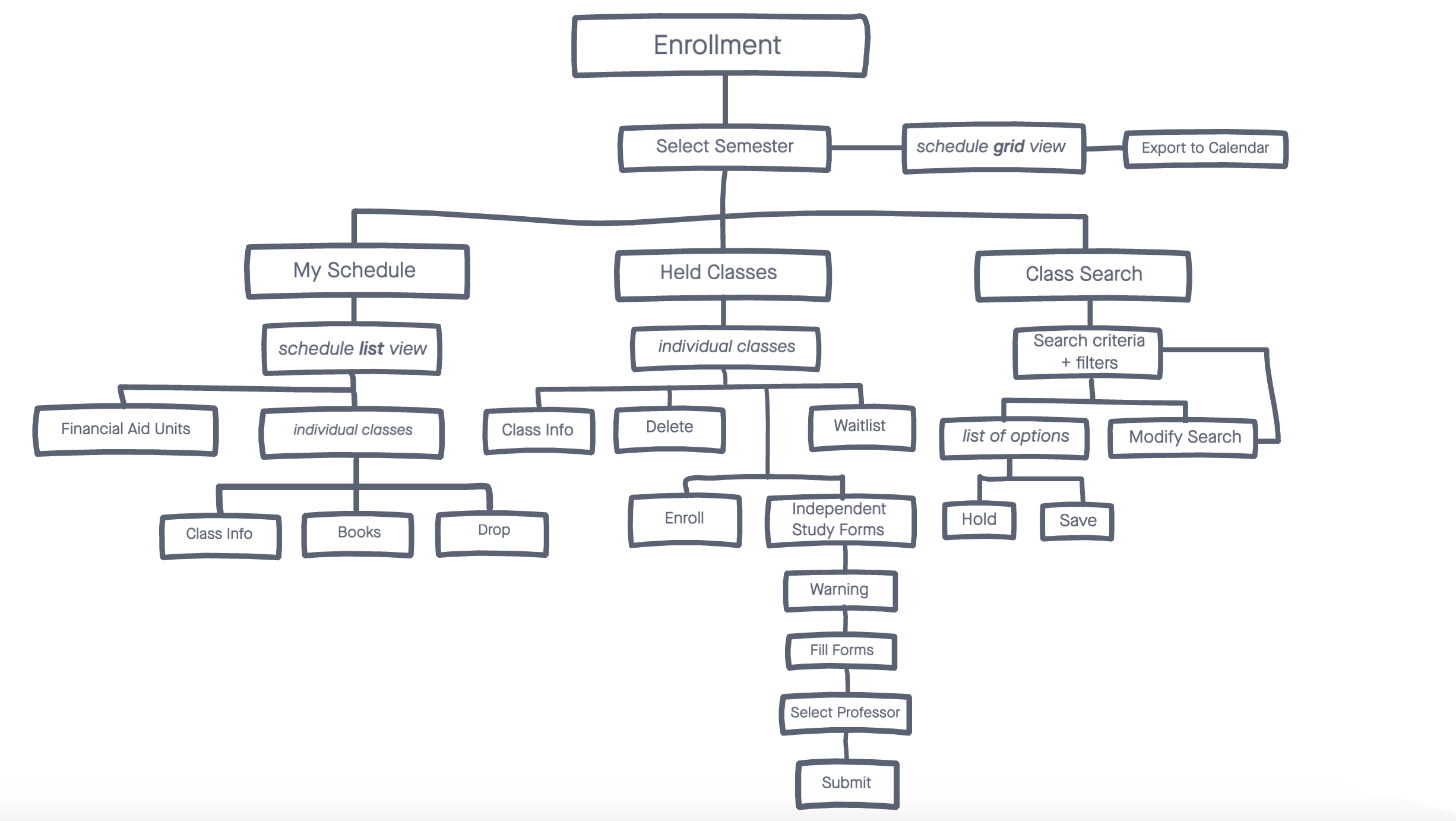
Going back through the screens of this process, I then created a task flow of the links and connections of the Enrollment Wizard as it is right now. I went through and marked it up based on my survey, observation, and other notes.


Finally, I went about outlining layout maps of each screen of this interface. The pink represents a header, the blue is a menu, the purple is the calendar, and the yellow represents the useful/manipulable part of the screen.


With all of this information in hand, I was finally ready to move on and start developing a new form for the “Enrollment Wizard” to take.
I began by developing a to-be task flow, applying the information I acquired thought my as-is flow, heuristic markups, and user survey/observation.
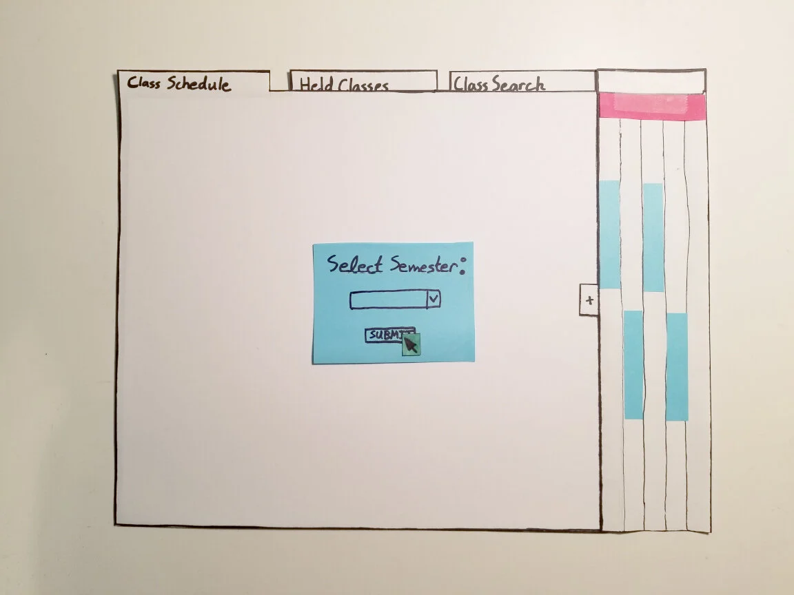
From there I created a paper prototype, focusing on the function I most wanted to implement: the integrated independent study registration. Currently, the process is entirely separate from this software and is very difficult to navigate on one’s own.
This prototype is also of a subsection of the screen; because the Enrollment Wizard is a function within the much larger MyPack Portal, I worked on the section within the MyPack Portal framework.


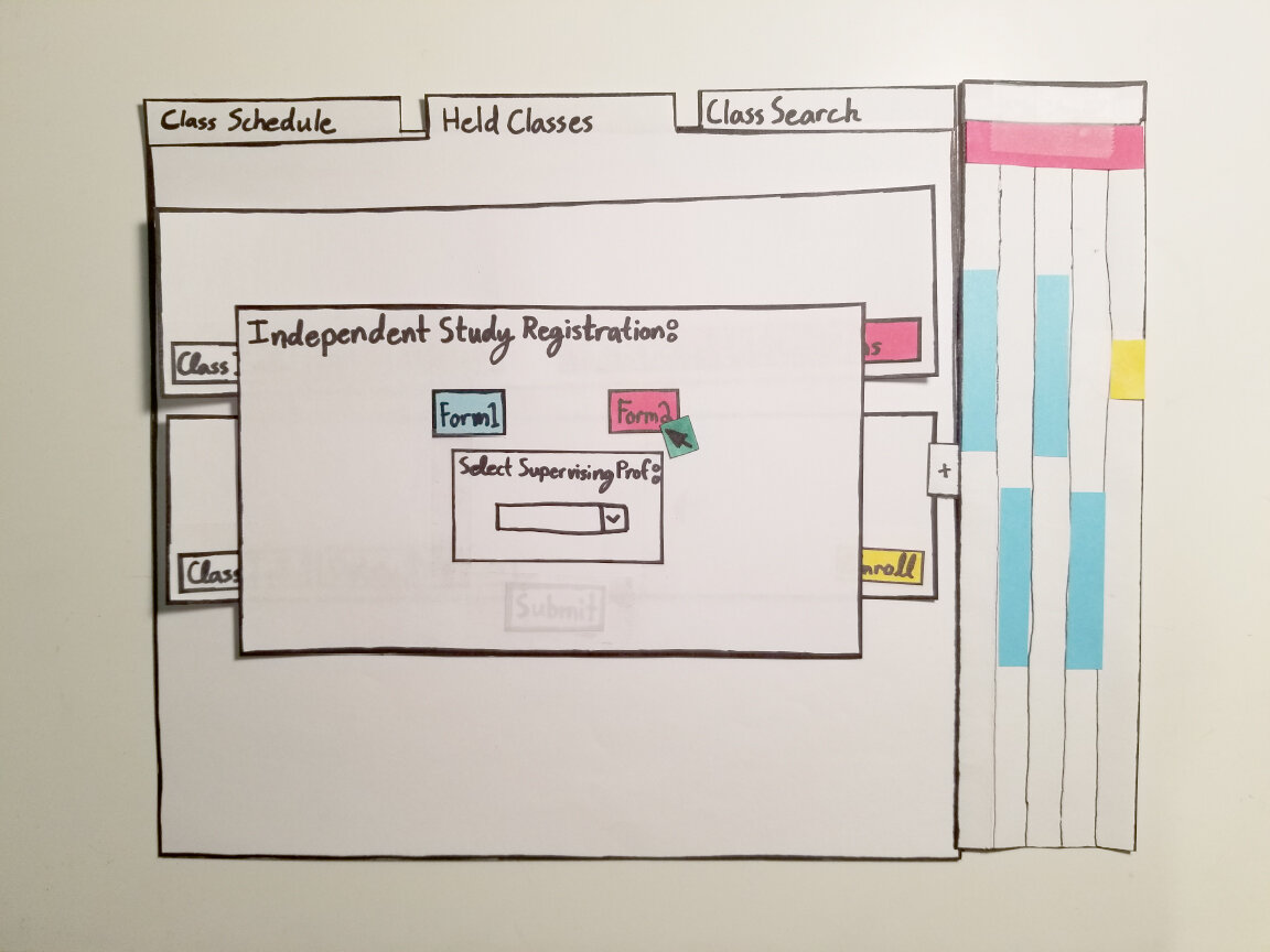


After completing this prototype, I was able to receive some feedback from a small selection of my user group. The main critiques were that the wording and functions for classes in the right two tabs were confusing, so I changed the “held classes” section to “shopping bag” moving forward.
As I moved on, I began creating low-fidelity wireframes in Adobe XD so that I could solidify my functions and screen layouts.


Once I completed my low-fidelity wireframes, I needed to set myself some rules for the visual language of this software. Basing my colors and fonts on the NC State official brand guides and using buttons and icons from external UX toolkits, I created a style guide for my higher-fidelity screens.

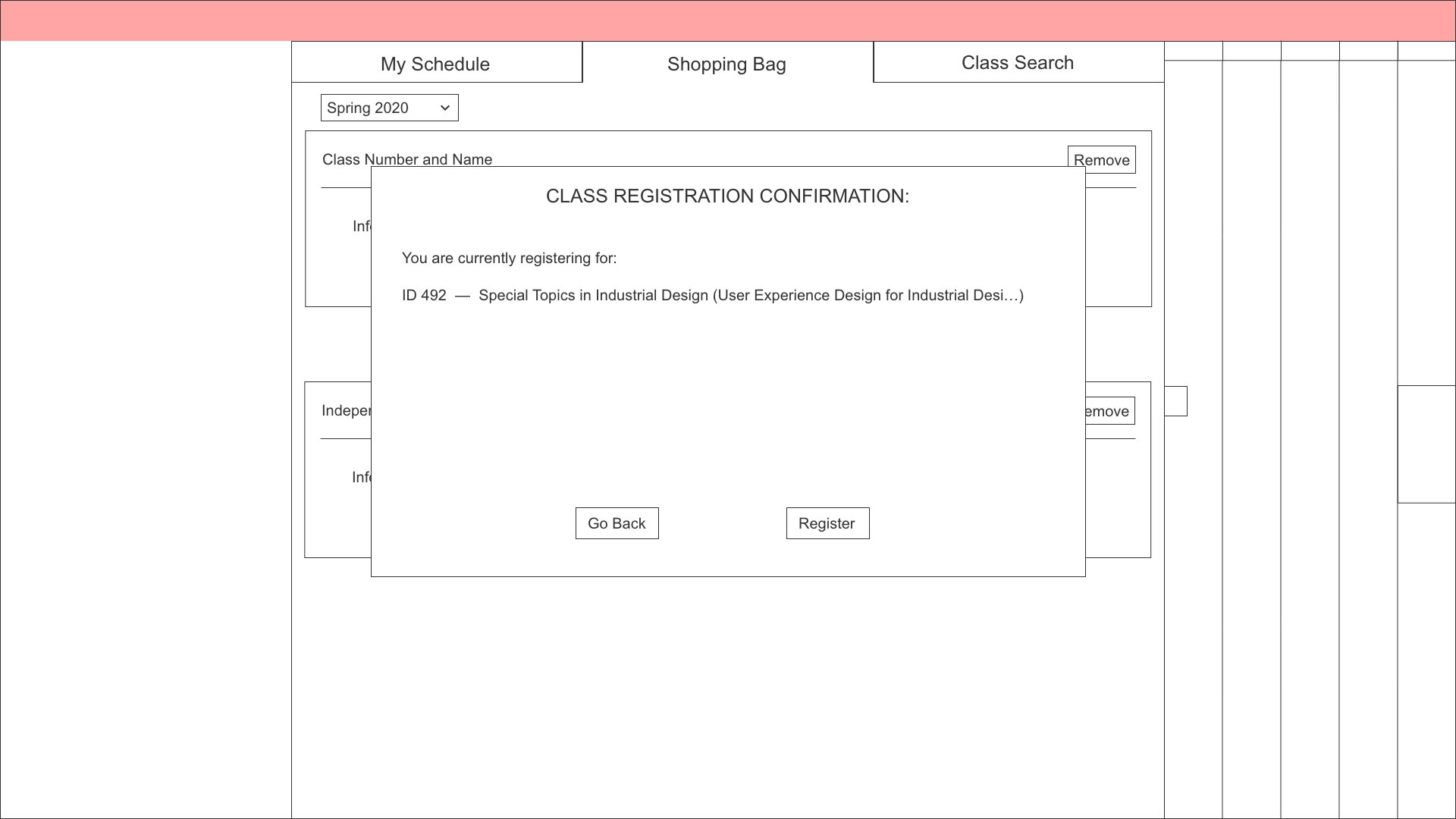
Finally, I made any necessary adjustments, filled in the functional gaps, and brought my wireframes up to a higher fidelity in order to utilize the style guidelines and make this feel like more of a real website.

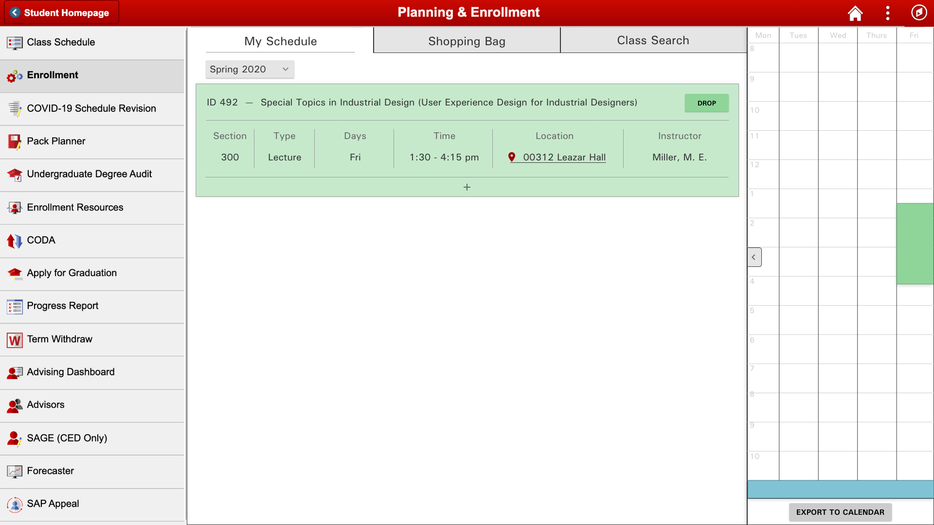
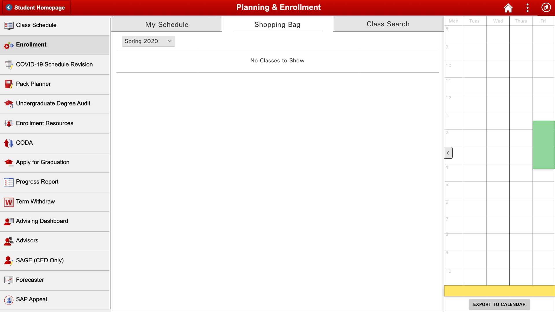
And here are those same screens, separated out into a gallery view.